Posted
 You may have noticed that Lancaster Mennonite School communications were increasingly referring to the school as simply “LM.” Indeed, the newspapers and much of the general public uses “Lancaster Mennonite” rather than the full name of the school or “LMS.”
 Aside from the growing natural use of “Lancaster Mennonite” without the word “School” at the end, LM now has six campuses that have campus names. Communication is much smoother when “school” is dropped when referring to campuses.An example of a major university using this type of branding is Pennsylvania State University, which is known to all as Penn State. Its campuses are called Penn State York, Penn State Altoona, and so on.
 The official name is still Lancaster Mennonite School for formal purposes. Pepsi’s official name is Pepsico, Inc. (previously Pepsi-Cola Company), but the branding is simply “Pepsi.”
The term “LMH” is still appropriate to refer to Lancaster Mennonite High School on the Lancaster Campus — a designation all the more important now that a high school also exists on the Hershey Campus.
The new logo and logotype (the distinctive font used for the name) was developed through a long process that involved input from all stakeholders, including an extensive survey. The survey results showed that there were generational differences regarding logo preferences, with persons in older generations usually preferring the less recent versions of various corporate logos. Therefore, it was vital that older persons reviewing the proposed logos lay aside their personal preferences to focus on what appeals to the GenX and Millennial generations.
The survey also revealed some cross-generational preferences. Respondents said they wanted a logo that was simple, classic, formal and literal. These four characteristics guided the selection of ideas brought forth by a team of marketing professionals with extensive experience in branding. If a design was too elaborate, trendy, informal or abstract, it was rejected.
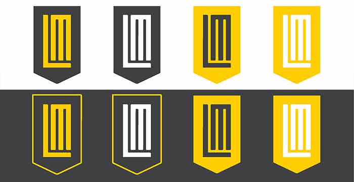
A key design factor was to create a versatile branding package that could be used effectively across all media and in many applications (tee shirts, signs, pens, etc.) without losing design quality or identity. Gary Hiller, LM’s director of marketing and communications, calls this type of versatile design “robust.” The design team spun out variations that use different combinations of a simple color palette to create an array of useful, cohesive options. The official school colors remain the same — black and gold — but a specific tint of each color may be used when a softer effect is desired.
The school is in the process of developing a new website that will incorporate the new visual identity throughout. Concurrently, the new look will take effect on all electronic media, with a target date of January 2. Print materials needed for 2017 will start appearing in early January.
In addition to the anniversary milestone and the new website this year, there are five reasons why organizations should update their branding and visual identity, all of which apply to LM. They are:
- Leadership Changes — New superintendent appointed
- Mergers and Acquisitions — More new campuses since the last logo was developed
- Changes in Customers — An increase in parents from a younger Millennial generation
- Brand evolution — PreK, more college prep classes, and innovative programs added
- Outdated Imagery – More younger respondents think our current branding is outdated

